…
Where to begin… This festival slowly permeated every layer of my life since I was first told it was happening about 4 and a half months ago. Having worked with Winter Circle Productions for about 2 years, I had always thought that a festival would be such a fun project for our lovely team to put together. When the announcement came I was filled with nervous excitement… What a fantastic opportunity to inject some DogPawsApproved flavour into a brand new, major music event for New Orleans. We had a few days of back and forth about what to name it, came up with Buku Music and Art Project (A play on the french word beaucoup-meaning more or many), I put together an initial branding image with some urban industrial flair, set up a facebook page and we were off…
So began some of the craziest months of my life… Never have I worked so hard or invested so much of myself into one project; definitely my biggest to date. I would wake up > go to my day job > come home at 5 and work until about 10 > repeat for months… And for the first time in my life, work actually felt kind of.. good(!). I was spending time designing collateral for a music festival with an amazing lineup… Not the worst kind of work, certainly. As the date drew closer, we began to think about the actual coordination of the event… Volunteer coordinators, media representatives, promo managers and team, artist hospitality… I had no idea how much went into throwing this kind of party, it was certainly eye-opening. And then there was the Art… What is a music and art project without art?! The need for an Art Director for the fest birthed a collaboration between Dirsign and DPA Universe: it became a Dirty Paws Event. The man behind Dirsign, Chris Berends, and I have worked together on installations and events in the past, but this was a special instance: our own festival, our own budget, free run of an amazing site… this was the beginning of something special. Throughout the whole process I discovered that we were truly a synergetic pair; with different backgrounds, disciplines and approaches. The result was something that I am extremely proud of and that I think was appreciated by festival attendees and organizers alike. Of course, none of this would have been possible without each individual group of our collaborators (many of whom put in AMAZING work just for exposure and the chance to be involved in such an exciting project). I am going to take this opportunity to break down each element of our art program, and will feature a list of special moments that made this experience for me, as well as my full photoset of the festival near the bottom.
The Front Entrance
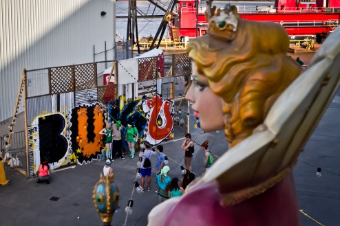
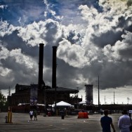
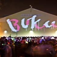
The front gateway of the festival was designed by Chris Berends of Dirsign and his team of Tulane Architecture students/rockstars. The entrance pavilion ushered festival attendees onto our grounds with an eclectic wall of recycled materials brought together with “BUKU 2012” written in varying fonts by participating graffiti artists Paws, Ishu, Evak, Ames, and Nobel. Halogen bulb strings were run across the entrance pathway to the wall, creating a gateway for attendees to enter the world of Buku under. At the source of the light strings stands a Mardi Gras Queen statue, offering a festive welcome for party-goers to truly leave the real world behind. This entrance way was our festival’s first impression, and I think it did its job tremendously. It brought to light the urban industrial feel that features of the site had led us to work towards, and emphasized our sustainable goals by using mainly recycled materials.
NPSAG: Grass to Grid
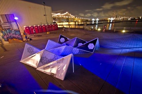
NPSAG id the name under which Tulane Architecture professors Nathan Petty and Sheena Garcia work together. They are an all-star team specializing in “the integration of radical architectural form and program with emerging technology and cultural speculation”. For our event they created a way-finding/directional installation exploring shape and the aesthetic of our specific site and the feeling of attending an electronic music event. About their installation, they say, “GRASS TO GRID is an installation project informed by the post-industrial landscape of the event site. The project is a speculation on the industrializaiton of the water’s edge and its reinvention through this emergent music scene. We found the location of the project at the event’s entrance to be a wayfinding beacon. The plan of the project inforces this idea through the creation of a directional arrow that facilitates flow from the entry past the piece and into the main event spaces. The triangulated skin of the piece is the manifestation of a differentiated height field that is varied from all angles of view. We created an artificial landscape which will allow visitors to view through it and to stand within it. The singular scale of the project places one within a smaller, intimate territory within the megascale of the event. The supergraphic of the skin is a gradient that further reinforces the ever-changing view points through the project. Two scales are exhibited on this skin – a macroscale that is perceivable from the entry and a microscale that is discernable up close. The project is intented to exhibit a high contrast graphic during the day time while also having the capacity to transition into the nights of the festivals with a striking, surreal glow.” Bravo, guys… It looked amazing.
Be Sure to check out their website here!
Mardi Gras Sculptures
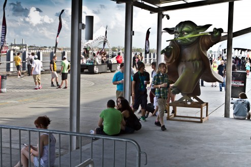
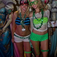
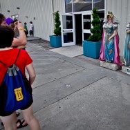
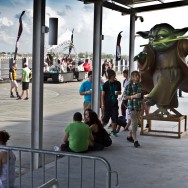
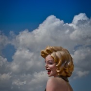
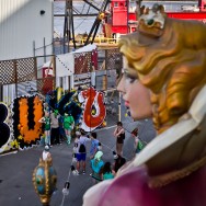
Scattered around the site were pieces of carnival history in the form of genuine Mardi Gras Sculptures once used in the parades. In the Dirty Paws style of art coordination, attention is placed on the history and feel of the specific site. We had to ask Mardi Gras World to pull some of these out for us to enjoy, and we’re glad they obliged.
The Fish Tank
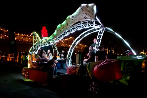
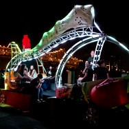
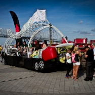
Fish Tank LLC is a growing fleet of art cars that make appearances and various music and culture festivals including Burning Man, Electric Daisy, and Art Basel. We had been in touch with the group before the festival and were lucky enough to have them bring their art to us… Pretty lovely group of people as well! The Fish Tank acted as a perfect chill and meet up zone right on the river, with cool breezes invigorating concert-goers as they rested their feet.
Check out their facebook page here!
PiNK powered by Moss
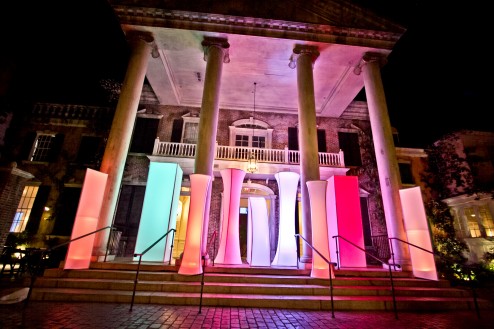
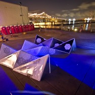
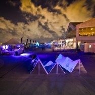
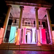
Scattered around the festival grounds were intriguing tensile fabric shapes designed by PiNK pb Moss. Paired with LED uplighting, these pieces added pleasing color and shape to the visual landscape of the festival. PiNK was generous enough to sponsor our art programming this year, and for that we are very thankful. They wrote a blog post about their experience participating in our inaugural year… Go check it out!
New Orleans Graffiti Showcase
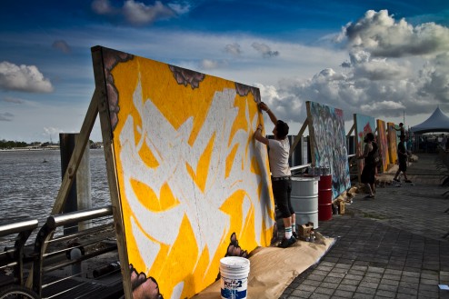
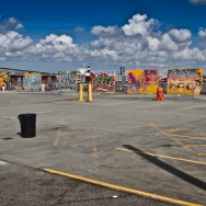
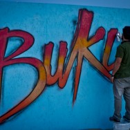
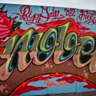
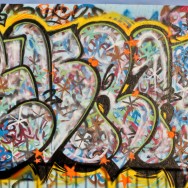
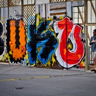
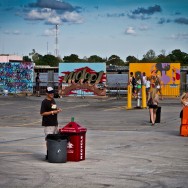
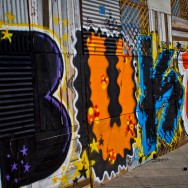
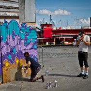
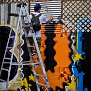
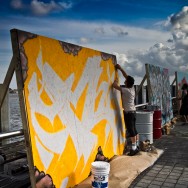
DPA Universe built walls and invited a premier group of New Orlean’s own local graffiti artists to come add some great pieces to our festival. We were excited to showcase the talented yet stigmatized art at Buku, and also to allow festival-goers to view the start-to-finish process of spray paint art. We decided to allow attendees to bid on the artwork to give them a chance to take a piece of Buku home, and also to allow for a better ending for the panels than the garbage can 😛 . I must say I am ecstatic at the response the graffiti showcase received at the festival-every panel was sold or ended up in great hands.
Laser Graffiti Wall
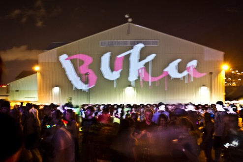
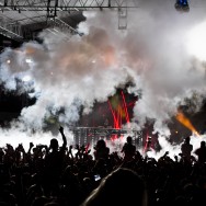
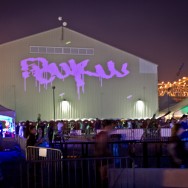
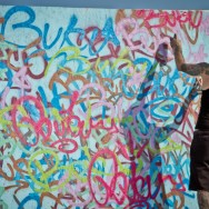
National artist and friend Skylar Fein offered to create a rig using the Graffiti Research Lab’s open source program to create a massive scale laser graffiti wall for the festival. It uses a camera, computer, projector and high powered laser to create an amazing large scale canvas for people to literally write by shining a laser beam at the surface of the wall. The set-up displayed hand-styles of local graffiti artists and the general public alike enormously as main-stage acts performed directly across the grounds.
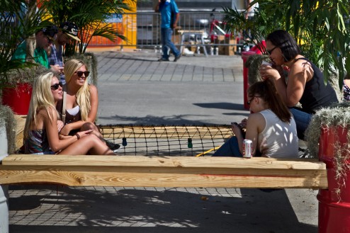
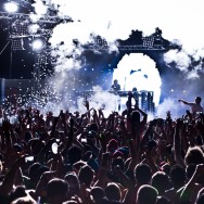
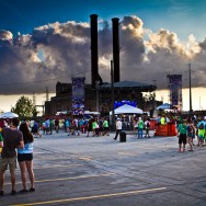
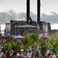
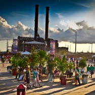
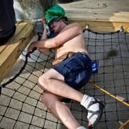
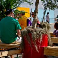
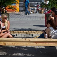
I may have saved the best for last here, although I probably shouldn’t be saying that haha. Designed by Art Ostrowski and built by a team of Tulane Architecture students, the Bukove was certainly the most beloved area of the festival grounds. We had originally wanted a way to bring some flora onto the grounds (as it is largely an industrial, concrete site) and this was the perfect way to do it. Modules of benching, netting and reused oil barrels formed the apparatus to sit or lay on for a moment of rest. Happy attendees could be found taking a load off in the Bukove at all hours of the event. Best part is, it was close enough to the mainstage that one could still rock out fully immersed in the music of some of the best acts of the weekend.
Organizing the art programming for this event is undoubtedly the hardest and most involved task I have ever taken on, but at the same time, has turned out to be the most rewarding. I hope everyone who joined us this year had a great time and enjoyed the environment we worked hard to create. Enjoy the photoset below and I hope to see you next year!
- Laser Graffiti Wall
- New Orleans Graffiti Showcase
- PiNK in the VIP Grotto
- The Fighting Fish Tank
- Mardi Gras Sculptures – Yoda
- NPSAG: Grass to Grid
- Buku Project Front Wall











cool!
This is a great blog you have here